
Tradoodle
Designing a family festival guide worth holding onto
- Year
- 2025
- Industry
- Arts & Culture
- Scope
- Website Design
- Timeline
- 1 month
- Archive
- 6 published artefacts

Starting condition
A busy programme had to make immediate sense to parents without losing the visual surprise that would draw children in.
Theatre, dance and eco workshops created a dense mix of times, formats and practical details. Families needed to find information quickly while moving between activities, but a purely functional timetable would not reflect Tradoodle's spirit of joy and discovery. The design therefore had to support two different reading behaviours: purposeful scanning by adults and more playful exploration by younger audiences.
Summary
- Business condition
- A busy programme had to make immediate sense to parents without losing the visual surprise that would draw children in.
- Organizing decision
- An illustrated storybook rhythm gives the schedule energy while keeping essential information easy to find.
- Studio contribution
- Print Design & Illustration Direction
- What you can inspect
- The work, and the decisions behind it.
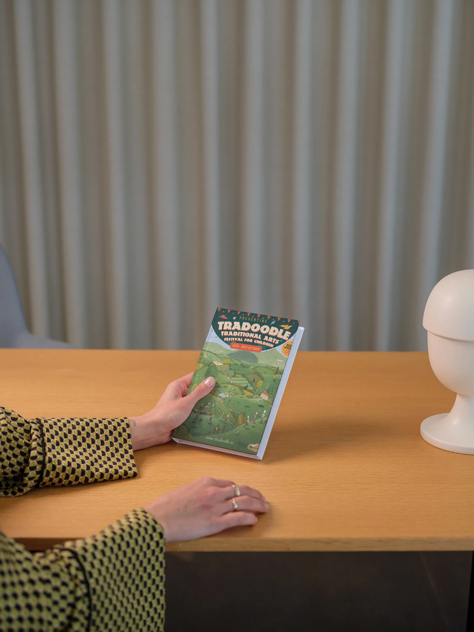
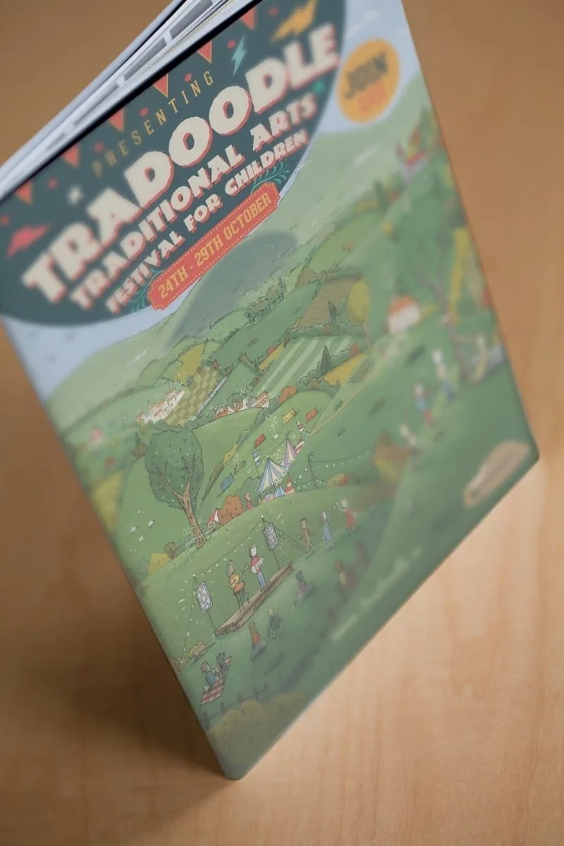
Selected detail from the project.
The sequence moves from the lead expression into interface, content and implementation detail. Every imported image remains available in the complete project archive below.

View the full image set2 more images


Design response
An illustrated storybook rhythm gives the schedule energy while keeping essential information easy to find.
Art direction, print design, layout strategy, illustration commissioning and typesetting were combined into a coherent booklet. Jacob Stack's illustrations move through and beyond the grid, supported by bold type, high contrast and a strong spread rhythm. Practical details retain a dependable hierarchy, while the artwork gives children characters and visual moments to follow across the programme.
Published process
Creative partnership and information design developed side by side throughout the one month programme.
We worked with Ceol Connected and illustrator Jacob Stack to establish a tone that felt upbeat, child friendly and useful. Schedules, event types and parent facing information shaped the page structure before illustration and typography added movement. Paper choice and print handling were treated as part of the experience, helping the finished guide feel considered without compromising clarity during a busy family festival.
System delivered
Evidence standard
Published work, with its source.
This profile carries the complete published project image set and identifies its source. Commercial results and third-party endorsements appear only when their source and publication status are clear.
Original published case record