
Mingle
A distinctive dating identity built around human connection
- Year
- 2024
- Industry
- Tech & Lifestyle
- Scope
- Branding
- Timeline
- 2 months
- Archive
- 7 published artefacts

Starting condition
Mingle had to feel approachable and recognisable in a category where many icons, colours and interaction cues look interchangeable.
The identity needed to work in the compressed space of an app icon and still support wider product, promotional and launch applications. Familiar dating symbols offered quick recognition but little ownership, while an overly abstract mark could lose the idea of connection altogether. The task was to find a simple visual thought that could remain warm, legible and useful as the brand moved beyond its first screen.
Summary
- Business condition
- Mingle had to feel approachable and recognisable in a category where many icons, colours and interaction cues look interchangeable.
- Organizing decision
- A negative-space mark makes the idea of meeting visible without falling back on a conventional heart symbol.
- Studio contribution
- Brand Identity & Logo Design
- What you can inspect
- The work, and the decisions behind it.
Selected detail from the project.
The sequence moves from the lead expression into interface, content and implementation detail. Every imported image remains available in the complete project archive below.



View the full image set3 more images

Design response
A negative-space mark makes the idea of meeting visible without falling back on a conventional heart symbol.
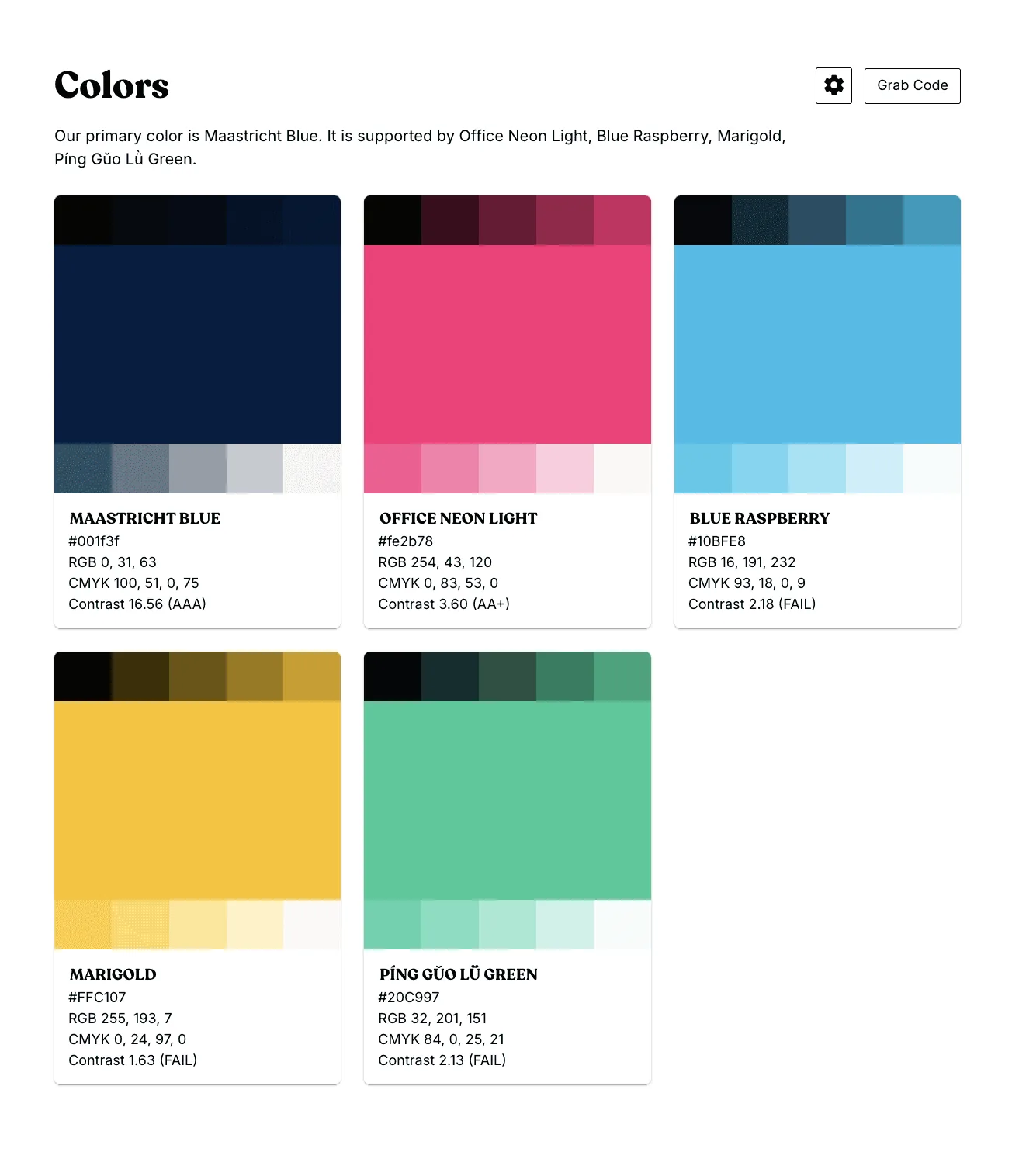
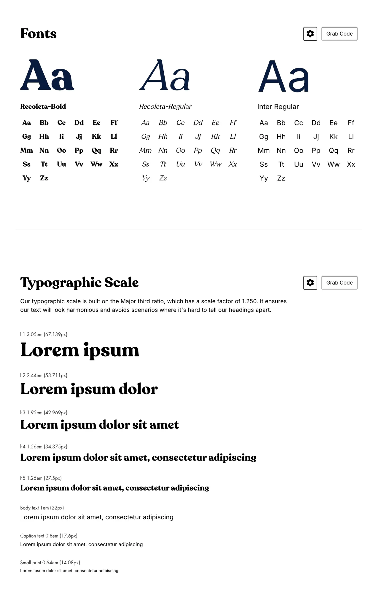
The custom logo forms both the letter M and two figures holding hands, allowing the product name and purpose to share one compact shape. A warmer palette and structured typography extend the tone without making the brand feel lightweight. Together, the elements provide a flexible identity for app surfaces, marketing assets and launch contexts while keeping the central idea recognisable at small sizes.
Published process
Category research narrowed the work toward a mark that could communicate connection in one glance.
We reviewed common dating app conventions, tested symbol and letter relationships and developed the strongest direction at the scales used in product interfaces. Once the mark was established, colour, typography, art direction and application rules were built around it. The process kept the system practical, ensuring the idea could survive icon use and still provide enough range for broader brand communication.
System delivered
Evidence standard
Published work, with its source.
This profile carries the complete published project image set and identifies its source. Commercial results and third-party endorsements appear only when their source and publication status are clear.
Original published case record