
Clonakilty Foods
Bringing range discipline to a familiar heritage food brand
- Year
- 2021
- Industry
- FMCG
- Scope
- Branding
- Timeline
- 6 months
- Archive
- 5 published artefacts

Starting condition
Range growth had to feel like a natural extension of the Clonakilty name, not a break from what shoppers already knew.
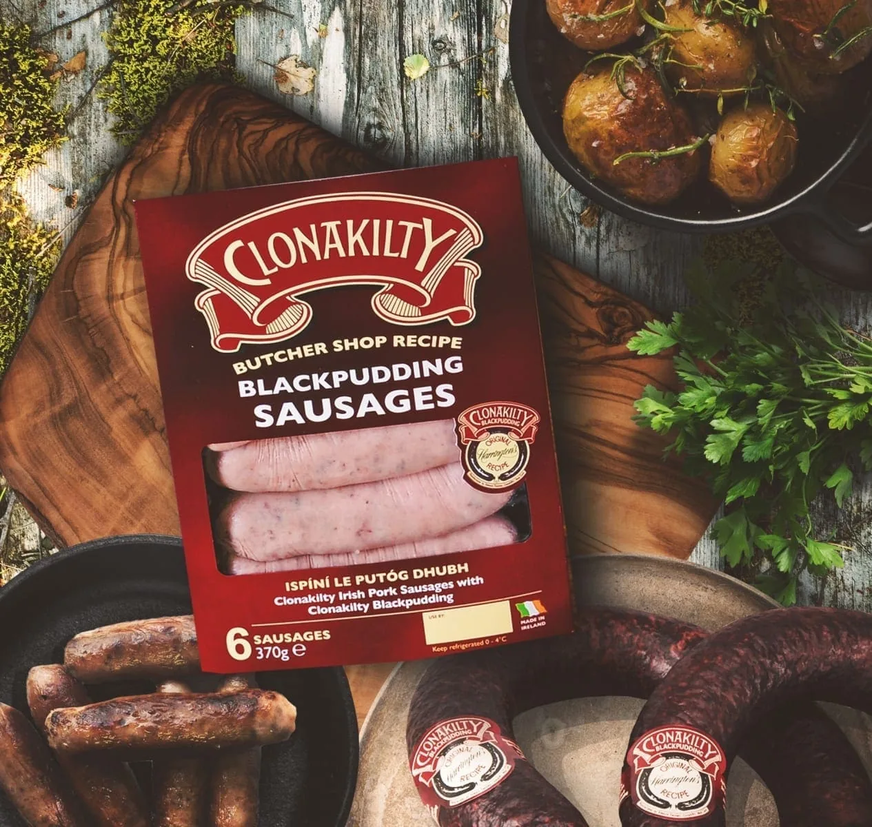
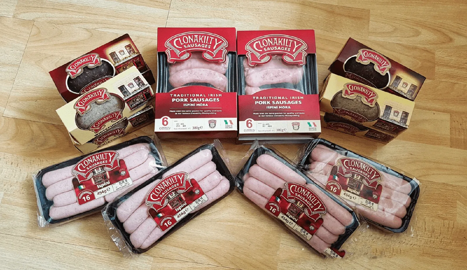
Food packaging is read quickly and in competition with many neighbouring products. Newer SKUs needed to be visibly related to the flagship range, while product names and key information still had to stand apart. The task was to bring more order to the portfolio without discarding the script, palette and other heritage cues that carried recognition and trust for existing customers.
Summary
- Business condition
- Range growth had to feel like a natural extension of the Clonakilty name, not a break from what shoppers already knew.
- Organizing decision
- A disciplined grid and hierarchy gave every product a place while keeping the master brand immediately recognisable.
- Studio contribution
- Visual Identity & Packaging Architecture
- What you can inspect
- The work, and the decisions behind it.
Selected detail from the project.
The sequence moves from the lead expression into interface, content and implementation detail. Every imported image remains available in the complete project archive below.

View the full image set1 more images
Design response
A disciplined grid and hierarchy gave every product a place while keeping the master brand immediately recognisable.
The packaging architecture retained established visual cues and organised them within a more consistent system for naming, product information and range relationships. Typography, spacing and print decisions helped individual SKUs remain distinct without drifting away from the Clonakilty family. The result supports current formats and provides a practical basis for future extensions, with the master brand holding a clear role throughout the portfolio.
Published process
Recognition was separated from habit so essential equities could stay while the wider system became easier to use.
We reviewed existing packaging assets, product information and print requirements to identify what carried genuine brand recognition and what could be organised more effectively. Typography, naming, pack hierarchy, finishes and production considerations were developed together, then checked across the range. That process created a system grounded in real shelf and print constraints rather than a single idealised pack design.
System delivered
Evidence standard
Published work, with its source.
This profile carries the complete published project image set and identifies its source. Commercial results and third-party endorsements appear only when their source and publication status are clear.
Original published case record